@g-n-particles
Active 8 years ago-

GN posted an update in the group
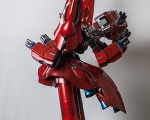
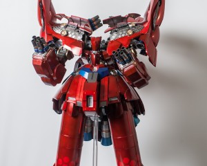
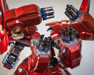
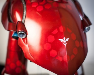
Completed Gunpla/Models 9 years, 8 months agoI just completed the build and paint of Neo Zeong: http://www.graemenattress.com/wp/1144-neo-zeong/ -
GN commented on the post, Gunpla TV – Episode 154 – 1/144 HGAW Gundam Airmaster! Youkai Watch Kits! 9 years, 9 months ago
Thanks for showing the cute cat kits for kids! They always like to build kits, so finding new ones suitable for them is great.
-
GN posted a new activity comment 9 years, 10 months ago
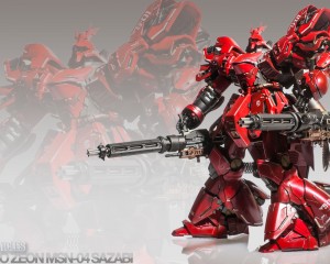
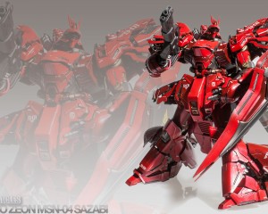
Yes, it’s very much like a candy coat, but with darker results with less bling. I also do the clear Tamiya colours over the Createx pearl colours which also produces a great result. You can see that on the red pieces on this kit.
-
Larryk's_nipples and
GN are now friends 9 years, 10 months ago -
Nacam Cpns and
GN are now friends 9 years, 11 months ago -
GN commented on the post, Gunpla TV – Massive Episode 150! – Kshatriya Repaired – Win stuff! 9 years, 11 months ago
Congratulations on making 150 episodes. Here’s to the next 150!
-
GN posted a new activity comment 9 years, 11 months ago
The recipe for the metallic blue is: Tamiya Gunmetal, Createx transparent blue, Tamiya clear blue.
The Tamiya gunmetal I used wasn’t very well mixed and was coming out quite bright, so you might want to go with a aluminum or similar to achieve the bright blue effect. You can see what better mixed gunmetal looks like on the sides of the legs where…[Read more]
-
GN posted an update in the group
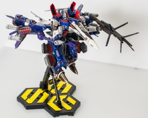
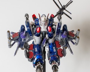
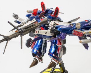
Macross Kits 9 years, 11 months agohttp://www.graemenattress.com/wp/vf-25f-172-armored-messiah-alto-custom-2/ – completed the Armored Messiah kit I’d bought last year.It was mostly a fun build, and at the end, I just built towards the transform mode I wanted to display in. The end result looks pretty good so I’m happy.
-
that is rhe shiniest most clean metallic blue I’ve ever seen!
nice work!
-
The recipe for the metallic blue is: Tamiya Gunmetal, Createx transparent blue, Tamiya clear blue.
The Tamiya gunmetal I used wasn’t very well mixed and was coming out quite bright, so you might want to go with a aluminum or similar to achieve the bright blue effect. You can see what better mixed gunmetal looks like on the sides of the legs where…[Read more]
-
thanks I actualy use gun metal alot, but I never tought of applying clear coats over it, I usually do silver chrome and clear colours over it, (i think it’s called candy finish) but that gives the illusion of tinted glass instead of a metallic colour. ill try your technique on the future, thanks for the tip!
-
Yes, it’s very much like a candy coat, but with darker results with less bling. I also do the clear Tamiya colours over the Createx pearl colours which also produces a great result. You can see that on the red pieces on this kit.
-
Pretty Awesome Man
-
-
GN posted a new activity comment 9 years, 11 months ago
The RG line is excellent. I think you’d enjoy almost any of the kits, but my favourites so far have been Justice, Freedom, Strike & Strike Freedom. They’re all nicely detailed and articulated, and indeed complex enough to keep you interested. The armour comes in many sections and usually with good colour differentiation to add real nice detail to…[Read more]
-
GN commented on the post, Gunpla TV – Episode 148 – RG Exia Build! 10 years ago
Thanks for the in-depth on the RG Exia.
-
drogoneye and
GN are now friends 10 years ago -
GN posted a new activity comment 10 years ago
I really like the stencil paint job.
-
GN posted an update 10 years ago
Fancy some nice pictures for your desktop?
http://www.graemenattress.com/wp/sazabi-desktop-pictures/ -
Yeronga and
GN are now friends 10 years ago -
GN posted a new activity comment 10 years ago
I’m looking forwards to the RG, and I got the PG 00 to keep me going at the top end of things. I thought the 1/60 Exia was fun though, and yes, it would make a lovely PG.
-
GN posted a new activity comment 10 years, 1 month ago
There’s definitely an interaction between top-coats and various pens we can use for panel lining: http://www.graemenattress.com/wp/panel-lining/ – so what I’ve ended up using is a combination of an oil-paint panel line wash over the gloss top coat, or careful use of a Rapidograph technical pen.
-
GN commented on the post, Gunpla TV – Episode 145 – MG Build Gundam Mk-II RX-178 – Damashii Kshatriya – Ma.K Super Jerry 10 years, 1 month ago
Pay raise and 2 eps a week from Syd and Ryan please!
-
GN posted a new activity comment 10 years, 1 month ago
What metal are you using? How are you cutting it?
-
GN posted a new activity comment 10 years, 1 month ago
That’s looking great!
-
GN posted a new activity comment 10 years, 1 month ago
Nicely different! Takes some guts to go for a colour scheme like that, and to pull it off!
- Load More


damm thats hot
Nice! May I know what paint you use for the red?
holy mama thats one awsome job
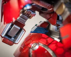
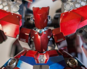
The main red is: undercoat: Alclad gloss black, a fine layer of Createx pearl red, and then a top layer of Tamiya clear red.
howd u do the hexagon design then thats hot
I show how I did it here: http://www.graemenattress.com/wp/1144-neo-zeong-part-3/ – basically lots and lots of masking, and I made a little template to help me keep the spacing right. The tricky bit was figuring the correct spacing to ensure that the design fit exactly.
Looking really awesome!!Very neat paintjob!It makes the kit look more detailed than an HG.
@GN HOLY MOLY that’s nice! I kind of wish you removed the seam lines but that’s personal preference. Outstanding job man. This is the first Neo Zeong I’ve seen painted. What a beastly kit. Happy building!
thats a S@!# ton of masking and work damm damm damm
Lots of masking!!! I was thinking of doing more, but I was happy with the added detail on the bland sections of the kit, and thought doing too much would detract from the overall effect.
excellent work. there’s a certain ratio of red to white to blue that makes it look almost Iron Man inspired. only criticism is a little to much silver for me, I like doing clear colors over gunmetal or graphites
Dam that is looking incredible! Better than my version.
Thanks for sharing!
that is quite the big beautiful monstrosity you have there. i fear that my mind would melt if i thought about the effort that went into your n-z for too long
HOLY SHEAAATTTSASAS